Boo Retail速溶咖啡包装设计_水果冰茶包装设计
作者:皇家亚美尼亚咖啡 时间:2024年01月31日 分类:速溶咖啡包装设计_水果冰茶包装设计
本篇文章主要是对Boo Retail速溶咖啡包装设计_水果冰茶包装设计的分享,是由皇家亚美尼亚咖啡创作设计的速溶咖啡包装设计_水果冰茶包装设计方案,希望可以给您带来设计灵感和参考价值。
Boo Retail速溶咖啡包装设计_水果冰茶包装设计
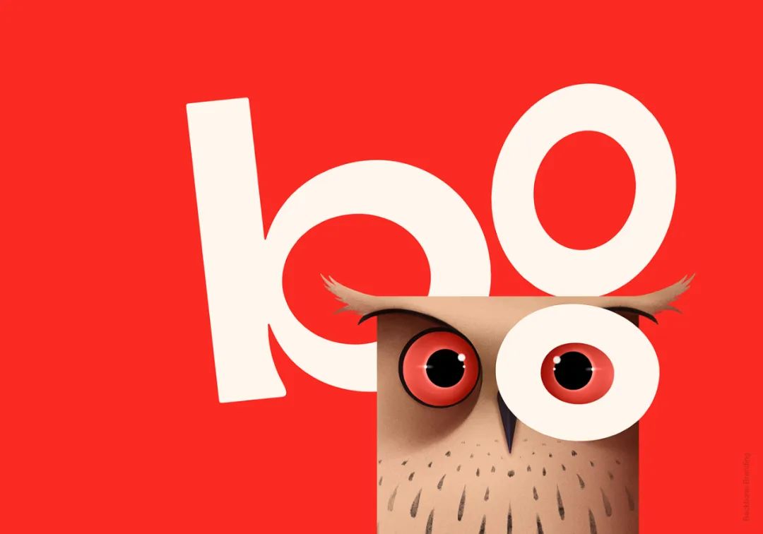
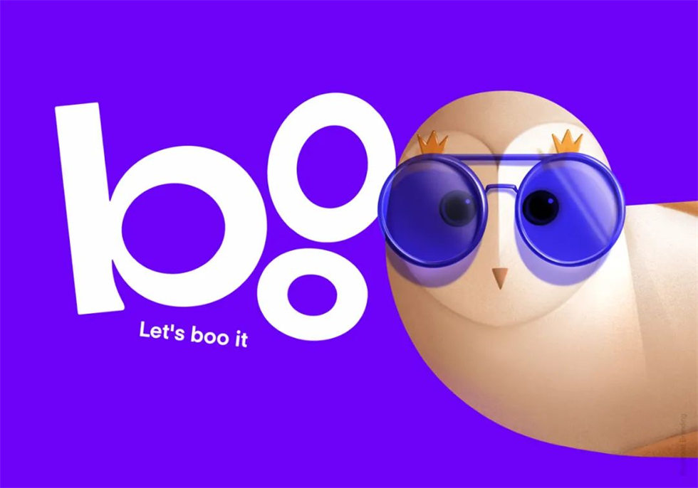
多年来,皇家亚美尼亚咖啡包装设计盒上一直点缀着一只优雅的猫头鹰插图,它已经成为产品的标志性象征,让人们亲切地称之为“boo”(在亚美尼亚语中意为“猫头鹰”)。
面对时光变迁,皇家亚美尼亚迎来了一个具有挑战性的任务:重新进行Boo Retail速溶咖啡和水果冰茶系列的包装设计,因为现有产品包装设计已显过时。然而,他们又希望在此过程中保持品牌的身份,将深受喜爱的猫头鹰作为零售产品包装设计的核心。
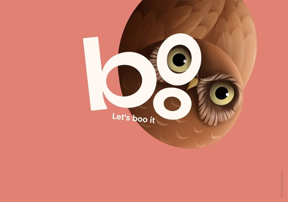
我们做出了一项策略性的决定,创造了一个名为“Boo”(猫头鹰)的子品牌,以延续多年来人们对产品的独特称呼。同时,我们将“Boo”演变成了一个独特的字母标志。
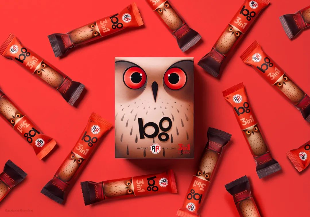
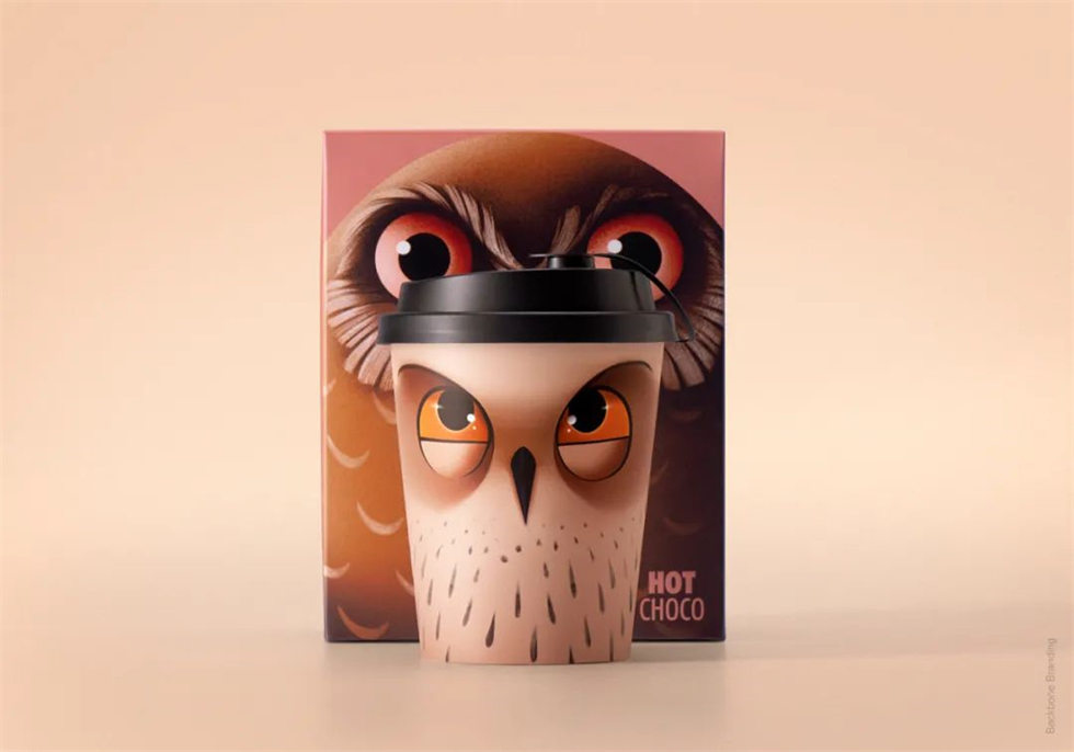
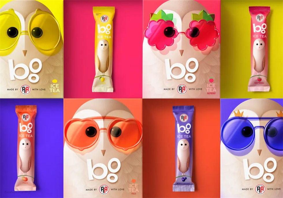
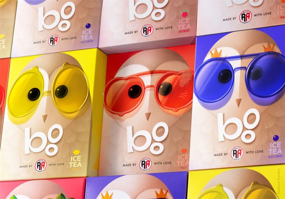
在全新的零售包装设计中,我们彻底改造了猫头鹰形象,将它打造成包装概念的焦点。新的猫头鹰更富有活力,更为宏伟,焕发着勃勃生机。除此之外,我们为其他产品线创造了两个全新的猫头鹰角色。我们巧妙地采用了旧包装设计的颜色逻辑,用以区分咖啡的不同种类,并将这种逻辑巧妙地应用于猫头鹰角色的眼睛上。此外,代表冰茶系列包装设计的猫头鹰角色戴着不同颜色和框架的眼镜,象征着茶中对应的水果和口味。
通过这次精心的速溶咖啡包装设计和水果冰茶包装设计,我们不仅成功保留了皇家亚美尼亚的品牌特色,还为其注入了全新的活力与生机,使消费者在每一次的选择中都能与这只可爱的“Boo”猫头鹰建立更加亲切的情感联系。
For numerous years, the enchanting visage of an owl has graced the packaging of Royal Armenia coffees, imprinting a lasting impression on consumers. This distinctive symbol has become so ingrained in the product's identity that it is affectionately referred to as "boo" in Armenian, signifying the revered owl.
In a strategic move, we conceived a subbrand christened "Boo," aligning seamlessly with the endearing moniker the product had acquired organically over the years. This metamorphosis extended to the creation of a distinctive typographic logo, further solidifying the identity of "Boo" as the central element.
Our redesign positioned the owl as the unequivocal hero of the packaging concept. This updated iteration exudes playfulness, boasts increased proportions, and radiates freshness. Expanding beyond the primary owl, we introduced two new owl characters to complement additional product lines, enhancing the brand's thematic richness.
In essence, our meticulous redesign not only preserves the legacy of Royal Armenia but also infuses a renewed vibrancy. The "Boo" subbrand, with its revamped owl iconography, stands as a testament to the brand's evolution, captivating consumers with a harmonious blend of tradition and modernity.


分享到 ![]()
![]()
![]()
![]()
版权声明:本篇文章由勤略品牌设计官网小编皇家亚美尼亚咖啡编辑,仅限于学习交流,非商业用途,版权归原作者所有,若有来源标注错误或侵权,请在后台留言联系小编,将及时更正、删除。
上一条:D-BROS 的2024龙年贺卡设计,还挺特别的 下一条:Muzigae Mansion唇釉包装设计 | 以绘画颜料为创意的护理产品包装设计
返回上一层